A strong brand isn’t just about a stylish logo. It’s about the company being instantly recognisable, whether customers come across you on your website, on Instagram, on a business card or in an advert.
This is where a fire safety guide becomes important.
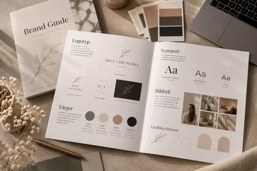
A brand guide brings together your brand’s visual guidelines in one place. It helps you use your logo, colours, typography, images and graphic elements consistently – both digitally and in print.
For small businesses, a brand guide doesn’t have to be a long and complicated document. Often, clear guidelines are enough to make it easy to maintain consistency in the company’s visual identity.
What is a fire safety guide?
A fire safety guide, also known as brand guidelines or a graphic design manual, which sets out how the company’s visual identity should be used.
It serves as a practical guide for everyone involved in the brand.
It could be you yourself, a web agency, a graphic designer, someone who works in social media, or a printing company that is to produce materials for the company.
Instead of each person having to guess which shade of blue is the right one or which font to use, everything is documented.
What does a fire safety guide contain?
The content may vary depending on the company’s needs, but some elements are particularly common.
Logo and logo variants
The brand guide shows which versions of the logo are available and how they should be used.
These could include, for example:
- main logo
- horizontal logo
- symbol or icon
- black-and-white version
- light version for a dark background
- dark version for a light background
It is also common to show how much white space the logo needs around it and how small it can be before it becomes difficult to read.
This way, you can avoid the logo being stretched, cropped or used in a way that weakens the brand.
Color palette
A clear colour palette is an important part of the visual identity.
The brand guide should show the company’s main colours and any complementary colours.
Colours are often specified with different values for different applications, for example:
- HEX for the web
- RGB for digital content
- CMYK for printing
- Pantone – when an exact print colour is required
This ensures that the company’s colours are as consistent as possible, regardless of where they are used.
Typography
Typefaces have a greater impact on a brand’s feel than one might think.
A brand guide shows which typefaces are used for, for example:
- headings
- subheadings
- body text
- quote
- buttons
- social media
There may also be recommendations regarding size, weight and combinations.
Clear typography ensures that the website, printed materials and social media all feel like part of the same brand.
Visual style and photography
Two companies can use the same colours and typefaces but still come across as completely different, depending on the images they choose.
For this reason, the brand guide can also describe the type of photography that suits the brand.
This may include:
- light or dark images
- natural or more stylised photographs
- people or environments
- close-ups or wider shots of the surroundings
- which colours are welcome in the pictures
A well-thought-out visual style makes a big difference, especially on the website and on social media.
Illustrations and graphic elements
A brand does not have to be built solely on the basis of a logo and photographs.
Illustrations, icons, patterns, lines and other graphic elements can give the company a more personalised look.
These could, for example, be simple illustrations that appear repeatedly on the website, or graphic elements used in presentations and on social media.
When these elements are defined in the brand guidelines, it becomes easier to create new material without losing the visual consistency.
Why do small businesses need a fire safety guide?
It’s easy to think that fire safety guides are mainly intended for large companies.
However, for smaller businesses, it can actually be particularly useful.
When time is limited, you don’t want to have to choose colours, fonts and image styles from scratch every time you create something new.
With clear guidelines, the work goes faster.
It also helps to create a more professional impression.
If a potential customer first sees your business on Instagram and then visits your website, it should feel like the same business.
The same applies when a customer receives a business card, a quotation or a leaflet.
A brand guide creates a consistent brand identity
Consistency builds recognition.
If a company is constantly changing its colours, typefaces and visual style, it becomes harder for customers to remember the brand.
That does not, however, mean that everything has to look exactly the same.
A good brand guide sets out a framework, not restrictions.
You can still be creative, but there is a clear foundation to build on.
Brand guide and web design
When we work with web design A clear fire safety guide is a big plus.
Colours, typography, buttons, images and graphic details can then be incorporated into the web design from the outset.
The result is a website that not only works from a technical point of view but also feels like your business.
For WordPress websites, the guidelines can also be used to create a consistent design system across the entire website.
Brand guide and social media
The same guidelines can be used when creating content for Instagram, Facebook, LinkedIn and other social media channels.
Instead of coming up with a new style for every post, you can stick to the same one:
- colours
- typeface
- illustrations
- image style
- graphic elements
This makes it easier to create a consistent visual flow.
It will also be easier to create templates for Stories, Reels, carousels and regular posts.
Fire safety guide for printed materials and promotional items
The fire guide is just as useful off-screen.
For example, when you place an order:
- business card
- flyers
- brochures
- signs
- clothes
- cloth bags
- event materials
the same colours, typography and logo guidelines can be used.
In this way, the company’s print and promotional materials a natural extension of the brand.
How comprehensive does a fire safety guide need to be?
It depends on the business.
A small business can often get by just fine with a few pages containing:
- logo
- colour palette
- typography
- image style
- some graphic elements
A larger brand may require considerably more detailed guidelines.
It’s not the number of pages that matters. What matters is that the guide is actually useful.
When is it time to draw up a fire safety guide?
A fire safety guide is particularly useful when:
- you’re starting a new business
- you’re rebranding
- several people produce content for the company
- The website and social media look different
- you often need to order printed materials
- you want the brand to come across as more professional
- you want to save time when creating new material
If you often find yourself thinking “Which shade of blue was it again?” it’s probably time to gather everything in one place.
A clear foundation makes design easier
Ultimately, a brand guide is all about making the brand easier to use.
Once the logo, colours, typography and visual style have been defined, it becomes easier to create a website, social media content, adverts and printed materials that all tie together.
A brand guide makes it easier to maintain consistency in the company’s visual identity across everything from the website to social media and printed materials.
At Svea Designs we help businesses with branding and graphic design to create a clear and well-thought-out visual identity that is easy to use in everyday life.

 Swedish
 English
 Spanish