I can spend a lot of time on an illustration—moving a line, changing a color, or tweaking a detail that perhaps only I notice. I have worked extensively in Illustrator, and I feel right at home there. But when we started using InDesign in the Visual Communication course, it was uncharted territory for me.
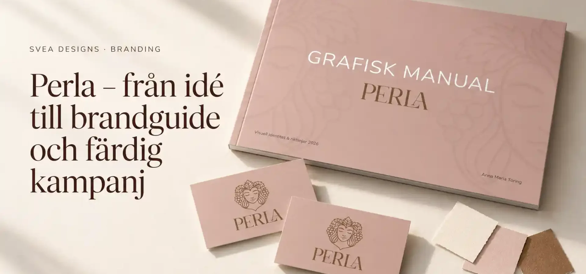
During the course, we worked with programs including InDesign and Photoshop. One of the assignments was to create a brand guide and then develop that visual style into a campaign. I chose Perla.
This is my interpretation of the brief: a warm and elegant concept where the logo, colors, illustrations, and campaign materials all belong together.
A new program and a different way of working
Having experience with Illustrator helped me with color and form. However, that didn’t mean I could immediately find my way around InDesign. I often knew the kind of feel I wanted to achieve, but I had to learn how to bring that about in a new program.
Furthermore, I had to consider several things simultaneously. In an illustration, I can focus on a single subject. In a brand guide, multiple pages need to work together, with a structure that helps the reader navigate the content.
Headlines, images, text, and white space therefore became a major part of the work. How much can fit on a page before it starts to feel too full? What needs more space? And how do you create variety without losing the underlying theme?
There was a lot of trying things out, moving things around, and taking another look.

My idea for Perla
With Perla, I wanted to explore a soft, warm, and elegant aesthetic. Light beige tones formed the foundation, complemented by brown and hues inspired by stone fruits and leaves.
I also wanted to add details to the concept that would make it personal. For this reason, the illustrated faces were incorporated as subtle lines in the background. They offer something extra to discover upon closer inspection, while ensuring the product remains the focal point.
The very combination of illustration and graphic design made the project enjoyable for me. I was able to take something I already enjoy and use it within a larger context.
From the name Perla to a logo
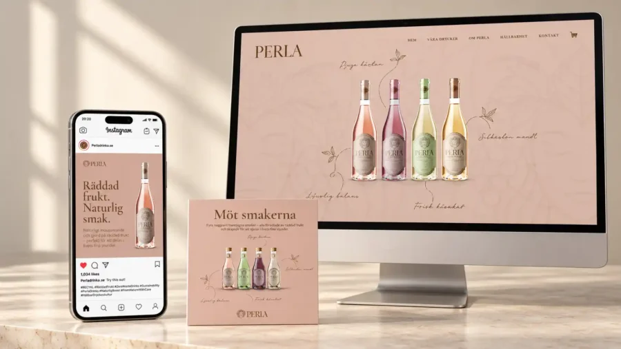
The logo became one of the first building blocks. I chose a style with serifs to achieve the elegant feel I was looking for.
Then I needed to see how it worked in conjunction with the rest of the material. A logo on a blank surface is one thing; on a label or a campaign poster, it encounters both images and other information.
Therefore, the work also concerned size, placement, and space. The name needed to be clearly visible, yet still feel like part of the whole.
The Brand Guide collected my choices
In the brand guide, I was able to gather and present Perla’s visual identity. The logo, colors, and typography needed to be clearly positioned so that the relationship between them could be understood.
This is where InDesign became a key part of the process. I got to practise laying out pages and spreads, but also deciding what actually needed to be included.
It is easy to want to show everything when you have worked on a project for a long time. At the same time, the content needs room to breathe. An image, for instance, can become more impactful when given more space, and a brief explanation can sometimes be more effective than a long paragraph.
What’s more, once all the parts came together in the document, it became easier to see what was working and what I needed to adjust.
From a brand guide to a finished campaign
When I started the campaign, I had to see how far the idea would go. Could I use the same visual elements and still create something that caught the eye?
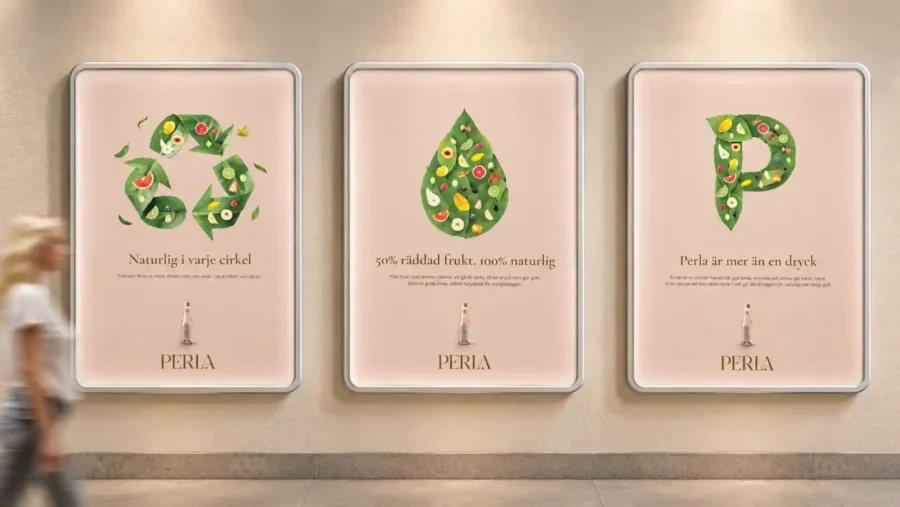
In the poster, the bottle takes centre stage, surrounded by stone fruits and leaves. Behind it, the subtle facial illustrations reappear. The warm tones and typography then tie the campaign in with the fire safety guide.
For me, this was one of the most enjoyable parts. The choices made in the brand guide had now become something tangible to build on. I could see how the logo, product image and illustrations all came together to create the Perla feel.
The work in Photoshop, InDesign and Illustrator thus became different parts of the same project.
Feedback that made me happy
After submitting my work, I received the following feedback on the course:
”Amazing, Anna Maria. So ambitious and well done.
You’ve put in the time, and it shows. And what a feeling!
”As for colour and shape, that’s top-notch.’
The feedback also highlighted how the campaign continued in the same spirit as the brand guide. That was particularly pleasing, as the connection between the two elements was precisely what I wanted to emphasise.
After many hours of work, it was lovely to hear that both the care that had gone into it and the visual appeal were evident.
What I’ve learnt from Perla
Perla gave me the opportunity to combine what I already knew with something I’d never done before. I was able to put my interest in illustration to good use whilst also starting to learn InDesign.
Above all, I was able to work on the entire process, from concept to presentation. Each part had to work on its own, but also contribute to the overall look and feel.
I still feel most at home in Illustrator. However, I’ve now opened the door to a new way of working, and I want to carry on exploring what I can do with it.
Perla is a school project from the Visual Communication course and forms part of my development as a designer behind Svea Designs.
 Swedish
 English
 Spanish