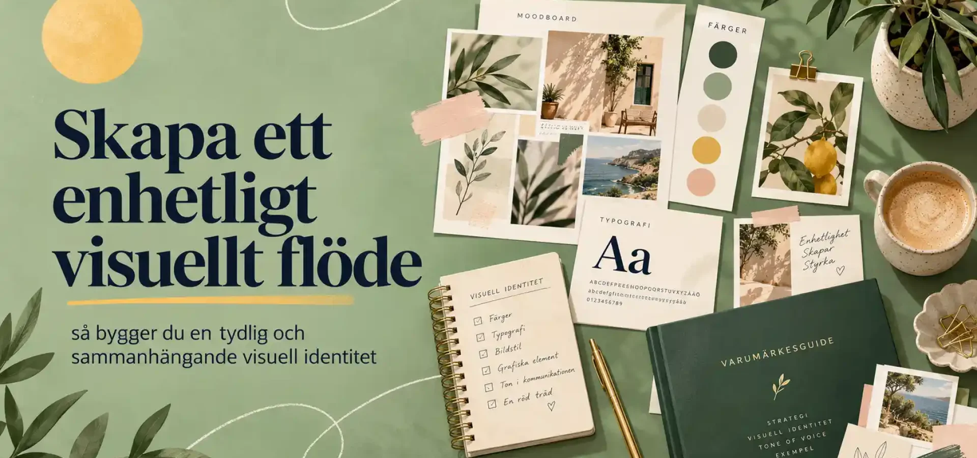
Create a cohesive visual flow
A consistent visual style makes your brand feel more professional, well-thought-out and easily recognisable. When colours, typography, images and graphic elements work together, they create a clear, cohesive whole – whether customers encounter you on your website, on social media or in printed material.
For small businesses, it is particularly important to build brand recognition. You don’t need loads of content or a sophisticated design. The most important thing is that your brand identity feels consistent.
Here, we’ll walk you through how to create a visual flow that brings your brand together.
What is meant by ‘visual flow’?
Visual flow is about how the different elements of your design interact with one another.
These could include:
- colours
- typeface
- pictures
- illustrations
- icons
- forms
- layout
- image editing
- graphic details
When these elements are used consistently, a visual language is created that the customer learns to recognise.
A consistent visual style does not mean that everything has to look exactly the same. Instead, it is about creating variation within the same visual style.
1. Start with a clear colour palette
Colour is often the first thing we notice.
That is why a well-thought-out colour palette is the foundation of a cohesive visual flow.
Please select:
- a main colour
- one or two secondary colours
- neutral tones
- an accent colour
When the same colours are used consistently across the website, social media and printed materials, this creates clear brand recognition.
It is also important to decide how the colours should be used.
For example, the main colour can be used in headings, whilst the accent colour is used for buttons and key details.
2. Use the same typeface
Typography has a greater impact on a brand’s feel than many people realise.
A modern sans serif typeface can create a completely different look to a classic serif typeface.
To ensure a clear visual flow, it is a good idea to decide:
- font for headings
- font for body text
- sizes
- weight
- line spacing
- how text should be positioned
Try to avoid using too many different typefaces.
Two well-chosen typefaces are often enough to create both variety and a clear structure.
3. Create a consistent visual style
Images play a major role in how a brand is perceived.
If some images are dark and dramatic whilst others are bright and colourful, the overall effect can feel a bit chaotic.
You should therefore consider which visual style suits the brand.
For example, it could be:
- bright and natural
- colourful and playful
- minimalist
- warm and soft
- vibrant and high-contrast

When the same feeling recurs in the images, a clearer visual flow is created.
4. Use recurring graphic elements
Small graphic details can make a big difference.
These could include:
- lines
- circles
- pattern
- illustrations
- icons
- frames
- colour block
When certain elements recur, a sense of coherence is created.
It helps customers recognise your brand even when the logo isn’t visible.
5. Strike a balance between variety and familiarity
A visual flow should not feel monotonous.
There needs to be some variety.
For example, you can alternate between photographs, illustrations, text-based posts and graphic designs.
However, the variations must still adhere to the same visual guidelines.
Colours, typography and design language should tie the content together.
That way, the design feels vibrant without becoming disjointed.
6. Keep the bigger picture in mind when it comes to social media
On social media, the visual flow becomes particularly clear.
When someone visits your profile, they see several posts at once.
If each post has a completely different style, the profile may seem disjointed.
Instead, try to create a visual rhythm.
For example, you could alternate between:
- photographs
- tips
- quote
- illustrations
- services
- client projects
At the same time, you use the same colours, fonts and visual style.
This means that the content feels varied yet clearly linked to the same brand.
7. Adapt the design to suit different formats
A consistent visual style must work across a variety of surfaces.
The design must be adaptable to:
- website
- presentations
- newsletter
- business card
- brochures
That does not mean that the same layout has to be used everywhere.
Instead, the same visual identity should be adapted to each format.

It is precisely this consistency that makes a brand feel well thought-out.
8. Create templates for recurring content
Templates are a simple way of maintaining a consistent visual flow.
You can create templates for:
- Instagram post
- stories
- presentations
- offers
- customer case study
- blog photos
- newsletter
Once the basic design has been finalised, it becomes easier to create new content.
It also saves time and reduces the risk of the design becoming disjointed.
9. Create a simple visual guide
A graphic guide doesn’t have to be complicated.
For a small business, a few clear guidelines may be enough.
The guide may, for example, include:
- colour codes
- typeface
- logo variants
- image style
- illustrations
- icons
- example of a layout
This makes it easier to maintain the same visual style over time.
It is particularly useful if several people are creating content for the company.
10. Allow the brand to evolve without losing its identity
A visual flow does not have to be static.
Brands evolve.
New colours, images or graphic details may be added over time.
The important thing is that the changes feel like a natural evolution of the existing style.
If the foundation is clear, it becomes easier to refresh the brand without losing its recognisability.
That is why a consistent visual flow is important
A consistent visual identity does more than simply create an attractive overall look.
This helps the brand to:
- feel more professional
- create a sense of recognition
- build trust
- communicate more clearly
- stand out from the competition
When customers are repeatedly exposed to the same visual style, it becomes easier for them to remember the company.
Summary
A consistent visual flow is created by using colours, typography, images and graphic elements in a consistent manner.
It’s not about everything looking the same.
Instead, it’s about creating a clear visual theme that runs consistently across the website, social media and other marketing materials.
With a clear colour palette, a consistent visual style and a few simple design guidelines, it becomes much easier to create a strong and recognisable brand.
Find out more about our services
Would you like to create a clearer and more cohesive visual identity? Find out more about our services in branding and graphic design and how Svea Designs can help you create a consistent brand identity for your business.

 Swedish
 English
 Spanish