
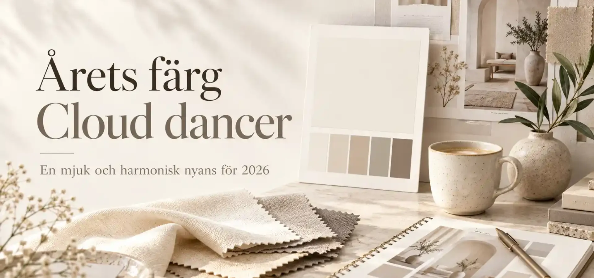
Every year, Pantone selects a colour to reflect something of the times we live in and the mood that characterises design, fashion, interior design and visual communication. For 2026, the colour is PANTONE 11-4201 Cloud Dancer – a soft, airy shade of white with a calm and balanced feel. Pantone
Unlike bold, on-trend colours that immediately catch the eye, Cloud Dancer acts more as a base. It creates space for other colours, materials and graphic elements to stand out.
This is particularly interesting when it comes to branding and graphic design. A neutral colour does not have to be boring. On the contrary, it can create balance, clarity and a more carefully considered visual identity.
What is Cloud Dancer?
Cloud Dancer is a soft white shade that Pantone describes as calm, airy and flexible.
The colour has been designed to work both on its own and in combination with other shades. It can create contrast, enhance other colours and serve as a neutral base within a wider colour palette. Pantone
It is precisely this flexibility that makes colour so interesting in graphic design.
Rather than competing with other colours, Cloud Dancer helps to create texture and balance.
Why was a shade of white chosen as the colour of the year?
The choice of an almost white colour may seem unexpected at first.
However, Pantone’s concept behind Cloud Dancer is very much about the need for calm, clarity and space at a time when we are constantly bombarded with information, images and stimuli.
Pantone describes the colour as a kind of visual pause – much like a blank canvas where new ideas can take shape. Pantone
It also fits in well with a wider design trend in which more brands are incorporating more white space, simpler structures and a clearer balance between colour and neutrality.
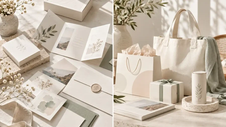
A neutral colour doesn’t have to feel cold
White is sometimes associated with minimalist and rather cold design.
Cloud Dancer is designed to work differently.
This shade has a softer look, which means it can be used with both warm and cool colours.
This means it goes just as well with:
- beige and sand
- dark green
- wine red
- muted blue
- powder pink
- brown
- warm yellow tones
The result can be both calm and modern without feeling sterile.
Cloud Dancer in graphic design
In graphic design, Cloud Dancer can primarily be used as a base colour.
For example, it can be used as a background in:
- web design
- logos
- presentations
- social media
- printed matter
- packaging
- graphic profiles
By using a light, neutral background, typography, photographs and accent colours are given more space.
It also means that the design can feel more airy and accessible.
Cloud Dancer in branding
For a brand, colours need to work well together over time.
That’s where a neutral shade such as Cloud Dancer could come in handy.
It can form part of the brand’s core colour palette, whilst stronger colours are used for elements such as buttons, logos or graphic details.
That way, the neutral colour does not have to be the most prominent one.
Instead, its role will be to strike a balance between the other parts.
It can be particularly effective for companies wishing to create a look and feel that:
- modern
- calmly
- exclusive
- naturally
- creative
- minimalist
Combine Cloud Dancer with bolder colours
One of the strengths of Cloud Dancer is that it works well with colours that have more character.
Imagine, for example, a soft Cloud Dancer background combined with dark blue typography and a warm yellow accent.
Or combine it with dark green and terracotta for a more natural look.
For a creative brand, the colour can instead be used in combination with cobalt blue, pink or orange.
In that case, the neutral base serves as a way of allowing the stronger colours to stand out without the whole design feeling overloaded.
A good grounding in typography
Typography is a major part of graphic design in 2026.
Large headlines and more expressive typefaces often need a calmer background to work effectively.
In this case, Cloud Dancer could be a good alternative to plain white.
The difference is subtle, but a slightly softer shade can give the design a warmer and more polished look.
It is particularly useful in web design, where large white spaces can otherwise sometimes feel very stark.
Works well with textures
Cloud Dancer does not have to be used as a completely flat colour.
It also works well with textures and natural materials.
For example:
- paper
- fabric
- wood
- stone
- grainy surfaces
- hand-drawn illustrations
It can make the design more tactile and human.
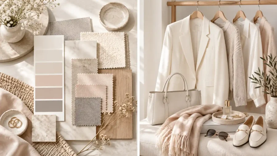
How small businesses can make the most of this year’s colour
You don’t need to revamp your entire brand just because Pantone has unveiled a new trend colour.
The best thing is to use it as inspiration.
If Cloud Dancer suits your brand, you could, for example, use it as:
- new background colour on the website
- neutral tone on social media
- background in product images
- colour in presentations
- the basis of a new campaign
- a complement to your existing colour palette
That way, you can test the colour without changing your entire visual identity.
How does Cloud Dancer differ from previous years’ colours?
Pantone’s colour choices can vary quite a lot from year to year.
Mocha Mousse was the colour of the year for 2025 and had a warm, brown and considerably richer tone. The year before, in 2024, the colour chosen was Peach Fuzz, a soft peach shade with a warm and more vibrant character. Pantone
Cloud Dancer takes a different direction.
Rather than being a distinct accent colour, it acts more as a neutral base.
It also says something about how design trends are evolving. After several years of distinct earthy tones and warm colours, we are now seeing greater interest in light, balance and simpler visual expressions.
What does ‘Colour of the Year’ actually mean?
Pantone’s Colour of the Year isn’t just about choosing a stylish shade.
The colour should reflect broader cultural and visual trends.
This might relate to how we furnish our homes, how we dress, the materials we use and the aesthetic we are seeking in design.
For graphic designers and brands, colour therefore often serves more as a source of inspiration than as a rule.
You don’t have to use Cloud Dancer just because it’s the colour of the year.
However, it may provide new ideas on how neutral colours can be used more strategically.
Is Cloud Dancer the right colour for your brand?
It all depends on the look you want to create.
Cloud Dancer is particularly well suited if you’re looking for a neutral and versatile colour that can be combined with other shades.
It can also be a good choice if you want to create more space in the design or tone down a colour palette that feels too intense.
For a strong and vibrant brand, it can serve as a contrast.
For a minimalist brand, it can instead become a key part of its very identity.
Summary
Pantone’s Colour of the Year 2026, Cloud Dancer, is a soft shade of white that symbolises calm, clarity and scope for creativity. Pantone
In graphic design, it can be used as a background, a base colour or a neutral element within a wider colour palette.
Perhaps the most interesting thing is that this year’s colour doesn’t have to take centre stage.
Cloud Dancer, on the other hand, shows how a subtle colour can help other colours, shapes and graphic elements take centre stage.
For brands, therefore, it is not a question of following the trend exactly, but of using it in a way that suits their own visual identity.
Find out more about our services
Would you like to create a colour palette that suits your business and stands the test of time? Find out more about our services in branding and graphic design and how Svea Designs can help you create a clear and personalised visual identity.

 Swedish
 English
 Spanish