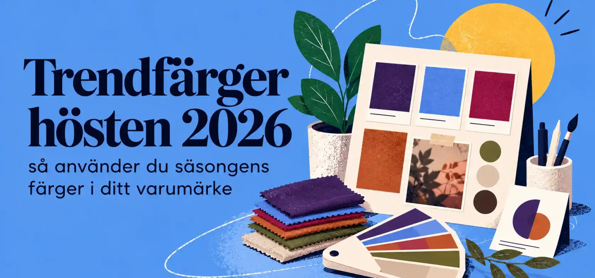
Autumn colours 2026 – colour trends for design and brands
The autumn colours of 2026 are characterised by warm, deep and earthy tones that create a sense of calm, quality and personality. At the same time, we are seeing bolder accent colours that bring energy and contrast to graphic design, web design and brand identity.
For small businesses, the choice of colour can make a big difference. The right colour palette not only helps to create an attractive look – it also influences how a brand is perceived and felt.
Here, we take a look at some of the key colour trends for autumn 2026 and how they can be incorporated into your visual identity.
1. Deep earth tones continue to dominate
Earthy colours have been popular for a long time, but in autumn 2026 they will become even deeper and more sophisticated.
We see a lot of:
- warm terracotta
- dark caramel
- rust-brown
- muted beige
- mole
- chocolate brown
These colours work particularly well for brands that want to come across as down-to-earth, personal and timeless.
They also go very well with natural materials, soft shapes and minimalist design.
2. Dark green is set to become a new base colour
Green remains a strong colour trend, but in autumn 2026 we are moving towards deeper and more muted shades.
Dark green, olive green and forest green are increasingly being used as alternatives to black, grey and dark blue.
It creates a softer yet still exclusive look.
Dark green works particularly well for:
- logos
- web design
- packaging
- printed matter
- social media
It is a colour that conveys balance, nature and quality.
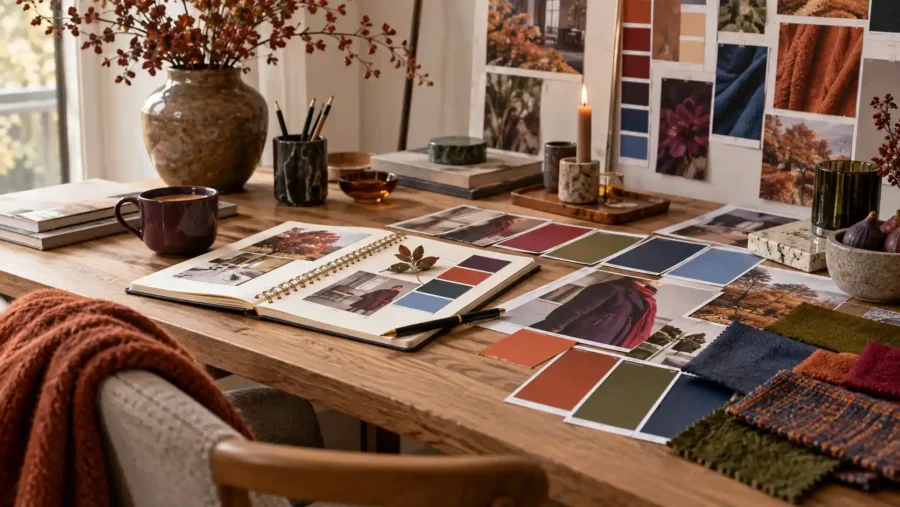
3. Wine red and plum add depth
Another clear colour trend for autumn 2026 is dark reds and purples.
Wine red, aubergine and plum create an elegant and creative look and work well for brands that want to come across as a little more exclusive or artistic.
They can be used as a base colour but also work very well as an accent against lighter shades of beige, pink or cream.
For small businesses, an accent colour like this can help to create a more personalised and memorable visual identity.
4. Butter yellow and warm yellow as accent colours
Yellow continues to play an important role, but in the autumn of 2026 the colour will become softer and warmer.
Instead of bright neon colours, we see more:
- mustard yellow
- butter-yellow
- honey-coloured
- golden tones
These colours work particularly well in smaller details, such as buttons, icons, headings or graphic elements.
A warm yellow accent can add energy to an otherwise neutral colour scheme.
5. Blue tones become deeper and more sophisticated
Blue is a classic colour in brand design, and in autumn 2026 it is often used in darker, more muted shades.
Navy blue, cobalt blue and grey-blue shades work well with beige, burgundy and warm brown tones.
Blue can convey a professional and trustworthy image without coming across as stiff.
It is therefore a popular colour for businesses that want to combine creativity with credibility.
6. Pink is becoming more muted
Pink isn’t going away, but the shades are becoming more sophisticated.
In the autumn of 2026, we’ll see less bright pink and more of:
- powder pink
- dusty pink
- rosé
- dusty pink
- beige-pink
These shades are soft and modern, and work particularly well with dark green, burgundy and brown.
7. Contrasts are becoming more important
One clear trend is that designers are making greater use of contrasts between light and dark colours.
A neutral base can, for example, be combined with a very dark accent colour or a bolder accent colour.
It helps to create a clearer hierarchy and makes the design more interesting.
In web design, contrast can also improve readability and make it easier for visitors to understand which elements are most important.
8. The colour palette becomes more flexible
In the past, many companies used a very strict colour palette consisting of two or three colours.
Now, however, we are seeing more flexible systems.
For example, a brand may have:
- a main colour
- two secondary colours
- several neutral tones
- one or two accent colours
This makes it easier to create variety across social media, web design and printed materials without the brand feeling disjointed.
9. Colour should feel personal
The autumn colour trends for 2026 are not just about which colours are in fashion.
It’s also about choosing colours that suit the brand’s personality.
A creative business might opt for stronger contrasts and unexpected combinations, whilst a business seeking to convey a sense of calm and exclusivity might choose deep earthy tones and soft neutral colours.
The most important thing is that the colours feel well thought-out and consistent.
How do you choose the right colours for your brand?
Don’t start by asking which colours look best.
Ask this instead:
- How do we want the brand to be perceived?
- What emotions should the colours convey?
- Which colours are suitable for the target audience?
- How do colours work digitally and in print?
- Is the contrast sufficient to ensure good readability?
A good colour palette should work across a range of different surfaces whilst still feeling like the same brand.
Summary
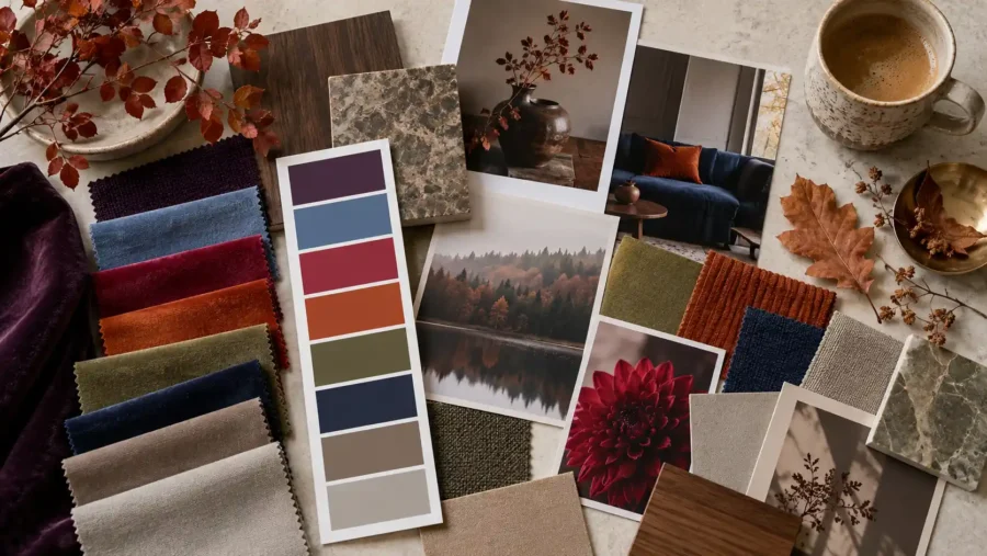
The autumn colours of 2026 are characterised by deep earthy tones, dark green, burgundy, soft yellows and muted pinks.
At the same time, contrasts and flexible colour palettes are becoming increasingly important in both web design and graphic design.
That doesn’t mean you need to change your entire visual identity every time a new trend comes along.
The best thing is to choose the colours and ideas that suit your brand and use them in a way that feels personal and sustainable.
Find out more about our services
Would you like to create a clear and well-thought-out visual identity for your business? Find out more about our services in branding and graphic design and how Svea Designs can help you create a look that feels both personal and professional.

 Swedish
 English
 Spanish