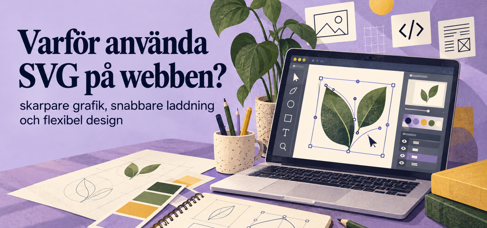
SVG on the web is a smart choice for logos, icons, symbols and other vector graphics. The format can be scaled up or down without the graphics becoming blurred or pixelated.
Furthermore, SVG works very well in responsive web design, as the same file can be used on mobiles, tablets and desktops. For photographs, however, WebP is usually a better option.
By choosing the right image format for the right type of content, you’ll achieve both better quality and a faster website. Here, we’ll look at why SVG is useful, when it’s most suitable, and how it differs from WebP, PNG and JPG.
What is SVG and how does the format work?
SVG stands for Scalable Vector Graphics and is a vector-based image format.
Unlike photographs, which are made up of pixels, vector graphics are composed of lines, shapes, curves and colours. This means that the graphics can be scaled up without any loss of quality.
A PNG or JPG image, on the other hand, has a fixed resolution. If it is enlarged too much, the edges may start to look blurred.
With SVG, this problem does not arise. The format is therefore particularly well suited when graphics need to work at a variety of sizes.
Crisp graphics in all sizes
One of the biggest advantages of SVG on the web is that the graphics retain their sharpness regardless of their size.
It is particularly useful for:
- logos
- icons
- symbols
- simple illustrations
- chart
- graphic forms
For example, the same logo can appear as a small detail in the mobile menu and as a larger graphic element on the home page.
That way, you won’t have to create several versions of the same image just to get the right quality.
A smart choice for logos
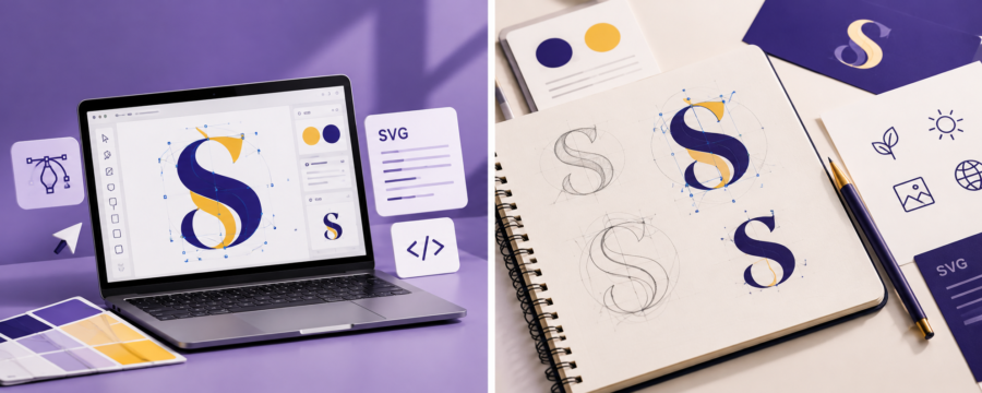
The logo is one of the clearest examples of graphics that are well suited to SVG.
A company logo is often used in a number of different places. For example, it may appear in the navigation bar, the footer, presentations and various sections of the website.
As the size varies, the logo must be able to be resized without becoming blurred.
That is why SVG is often a better option than a standard PNG file when the original is vector-based.
What’s more, the same file can be used on both small and large screens.
Better performance on high-resolution screens
Modern mobile phones and computers often have a very high pixel density.
This means that low-resolution images can easily appear blurred. Vector graphics, on the other hand, are not affected in the same way.
As the shapes are calculated based on the screen size, the graphics remain sharp even on Retina screens and other high-resolution displays.
This makes the format particularly useful for small details where clear lines are important.
Smaller files can result in faster loading times
A simple vector file can be very small.
This applies in particular to graphics featuring:
- few colours
- clean lines
- simple shapes
- symbols
- icons
That is why, in many cases, SVG can help to make a website lighter.
At the same time, it is important to remember that an SVG file is not automatically small. A complex illustration containing thousands of objects can be large.
For best results, the file should therefore be optimised before it is used on the web.
Flexible on all screen sizes
Responsive web design means that the content adapts to different screen sizes.
Vector graphics work very well here.
The same icon or logo can be used on mobiles, tablets and desktops without you having to export different image sizes.
What’s more, maintenance becomes easier as there are fewer files to manage.
This way, you’ll benefit from both a more flexible design and a simpler workflow.
Transparent background without an additional image file
Vector graphics can be used without a background.
This means that logos and icons can be placed on a variety of colours and sections without a white border around them.
For example, the same graphic can be used on:
- white background
- dark background
- coloured sections
- photographs
This makes the format particularly useful in modern web design, where the same elements often appear against various types of background.
Change the colour instantly with CSS
Another advantage is that the colour of certain SVG elements can be controlled using CSS.
This means that an icon, for example, can be blue in its normal state and yellow when the user hovers the mouse pointer over it.
Furthermore, the same element can be displayed in white against a dark background.
So, instead of creating several separate image files, you can reuse the same graphics.
This makes the design more flexible and can also reduce the number of files on the website.
Create movement and interaction
Vector graphics can also be used for small animations and interactive effects.
For example:
- a line is drawn
- an icon changes colour
- a symbol changes shape
- a graphic element reacts on hover
- parts of an illustration move
Such effects can help to bring the website to life.
At the same time, animation should always be used with a clear purpose. Too much movement can, on the other hand, make the page look cluttered and distract from the content.
That is why subtle animations often work best.
Photographs need a different format
Despite its many advantages, SVG is not the right choice for all images.
Photographs contain a great deal of detail, colour variations and shades. They are therefore better suited to raster formats.
For modern websites, WebP often a very good alternative.
WebP is suitable, for example, for:
- hero images
- portrait
- product images
- blog photos
- environmental images
- photographic backdrops
In this way, SVG and WebP can be used together rather than competing with one another.
WebP is better for photos
WebP has been developed for digital images and can often deliver high quality with a relatively small file size.
That is why this format is being used more and more frequently for photographs on the web.
A large photo saved as a PNG can be considerably larger than necessary. If the same image is exported as a WebP instead, the file size can often be reduced.
The result is a lighter page without the image looking noticeably worse.
A simple rule of thumb is therefore:
Logo and vector graphics → SVG
Photographs and hero images → WebP
How SVG and WebP complement each other
SVG and WebP are used for different types of content and therefore work very well together.
Vector graphics are best suited to logos, icons and graphic elements. Photographs, on the other hand, should usually be saved as WebP.
On a typical company website, it might look like this:
- logo → SVG
- icons → SVG
- vector illustrations → SVG
- hero-photo → WebP
- portrait → WebP
- blog images → WebP
- product images → WebP
By combining the formats, you get both sharp graphics and efficient image files.
The difference between SVG, WebP, PNG and JPG
All image formats have their strengths.
Logos and vector graphics without any loss of quality
For logos, icons, symbols and simple illustrations, SVG is often the best choice.
As the graphics are vector-based, they remain crisp even when their size changes.
WebP for photographs and hero images
WebP is well suited to images with a higher level of detail.
Furthermore, this format often results in smaller files than older alternatives.
That is why it is often used for photographs, product images and larger images on websites.
PNG when raster graphics require transparency
PNG is still useful when a standard raster image requires a transparent background.
The format is also well suited to certain screenshots and simple digital graphics.
However, PNG files can be large, particularly when they contain photographs.
JPG as an older photo format
JPG is still widely used for photographs.
The format works well, but WebP is often more efficient for modern websites.
That is why JPG is no longer always the first choice.
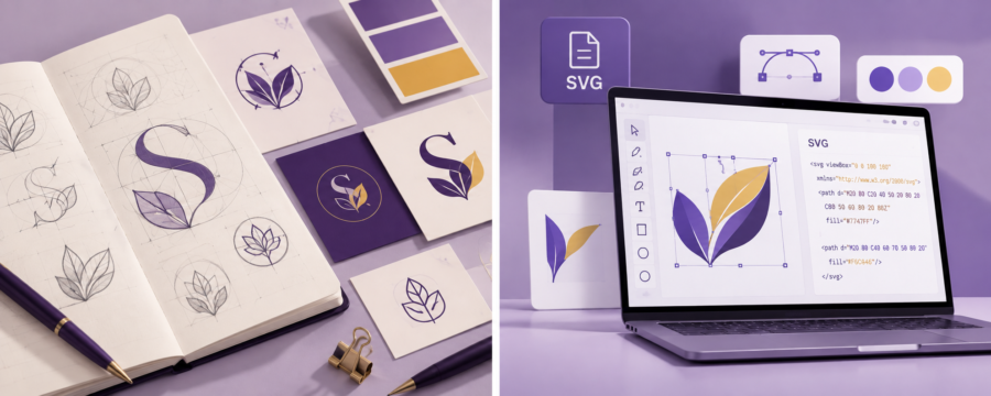
Image format affects website speed
Large images are a common reason why websites run slowly.
That is why image optimisation is not just about how an image looks.
You should also bear in mind:
- file size
- image dimensions
- compression
- lazy loading
- number of images on the page
- which format is used
For example, a hero image does not need to be 6,000 pixels wide if it is displayed at a significantly smaller size on the website.
By optimising your images, you can improve both loading times and the user experience.
Safe use in WordPress
WebP can normally be used directly in WordPress.
SVG, on the other hand, works a little differently.
The reason is that an SVG file is based on XML and may contain code. For security reasons, these files must therefore be handled correctly.
If you use SVG in WordPress, you should:
- use files from trusted sources
- export your own files correctly
- clean up SVG files
- use a secure plug-in or solution
This way, you can make the most of the format’s benefits without creating unnecessary security risks.
The security behind SVG files
An SVG looks like a normal image, but technically speaking, the file contains code.
Consequently, a tampered file may, in some cases, contain malicious content.
For this reason, you should not upload SVG files from unknown sources directly to the website.
Instead, use graphics that you have created yourself or obtained from a designer you trust.
In addition, the file can be sanitised before it is uploaded.
A company should have these logo files
When you commission a professional logo, it’s a good idea to receive it in several file formats.
A complete delivery may, for example, include:
- SVG
- PNG
- EPS
- JPG if required
For websites, SVG is often the most important vector format.
PNG, on the other hand, is useful on platforms that do not support SVG or when a standard transparent image is required.
PDF and EPS are often used for printing and other professional productions.
Do you need both vector and raster formats?
Yes, in many cases it’s a good idea to have both.
An SVG file looks great on a website, but not all systems and platforms support vector formats.
That’s why it’s still a good idea to have a transparent PNG version of the logo.
By saving multiple versions, you’ll always have the right file for the right purpose.
Icons that stay sharp
Icons are an area where SVG really comes into its own.
As they often consist of simple shapes, the file size can be kept small.
What’s more, the icons remain clear even when their size changes.
In many cases, colour and size can also be controlled directly via the web design.
This makes it easy to reuse the same icon in several places.
Illustrations that can be scaled without any loss of quality
Vector illustrations also work very well on the web.
An illustration with clear shapes and a limited colour palette can be scaled from mobile formats to large desktop sections without becoming pixelated.
At the same time, highly complex illustrations should be optimised.
If the file contains a large amount of detail, another format may sometimes be more effective.
That is why it is always a good idea to check the file size before publishing.
Good file names and alt text
The right image format is just one part of a well-optimised website.
File names should also be clear.
For example:
logotyp-webbdesign.svg
better than:
final-version-03.svg
For content images, alt text is also important when the image conveys relevant information.
Decorative images, on the other hand, do not always need descriptive alt text.
Use the right format for the right content
The most important thing is not to use SVG everywhere.
Instead, you should choose the format based on what the image actually contains.
Vector graphics work best as SVG, whilst photographs are usually better suited to WebP.
PNG is still useful when raster transparency is required. At the same time, JPG serves as an alternative on older systems and in certain specific situations.
By making the right choice from the start, you can avoid unnecessarily large files and poor image quality.
A great combination for modern websites
A modern corporate website often uses a variety of image formats.
A practical approach is:
SVG for logos, icons and vector illustrations.
WebP for photographs, hero images and blog images.
PNG when raster graphics require transparency.
JPG when there is a specific need, or when older systems require it.
That way, each image format can do what it does best.
Summary
SVG on the web is an excellent choice for logos, icons, symbols and other vector graphics.
As the format is scalable, the graphics retain their sharpness on both small and large screens. Furthermore, SVG often results in small file sizes and offers great flexibility in responsive design.
For photographs, however, WebP is a better option. PNG and JPG still have their uses, but should not automatically be used for all images.
In summary, creating a good website isn’t just about choosing a single image format. By combining SVG for graphics and WebP for photographs, you can achieve both high image quality and better performance.
Find out more about our services
Would you like to create a professional website where logos, images and graphic elements are optimised for the web? Find out more about our services in web design and graphic design and how Svea Designs can help you create a clear, fast and well-designed website.

 Swedish
 English
 Spanish