A logo is often the first visual impression people have of a company. It should be easily recognisable, work well in a wide range of formats and, at the same time, convey something about the brand’s personality.
But how do you find the right words?
Inspiration for logo design can come from many sources – shapes, symbols, letters, colours, typography and even the business itself.
The most important thing is not to start by asking “What looks good?”, but instead to consider what the logo is meant to convey and how it will be used.
Here, we look at different ways to find inspiration for logo design and how shapes, symbols and typography can be used to create a clear and distinctive look.
Start with the brand’s personality
Before you start sketching the logo itself, it’s a good idea to define the feel you want the company to convey.
Should the brand name be:
- modern
- personal
- exclusive
- playful
- creative
- safe
- minimalist
- traditionally
This affects which shapes, colours and typefaces are suitable.
A playful brand might, for example, use softer shapes and more personalised lettering, whilst a more exclusive company might be better suited to a clean and minimalist logo.
1. Geometric shapes
Geometric shapes are common in logo design because they are easily recognisable and easy to use in various formats.
Common examples include:
- circles
- squares
- triangles
- lines
- hexagons
- arches
Different shapes can evoke different feelings.
A circle can feel soft, whole and inclusive, whilst a square is often perceived as stable and structured.
Triangles can provide more energy and direction.
Geometric shapes work particularly well when you want to create a modern and distinctive logo.
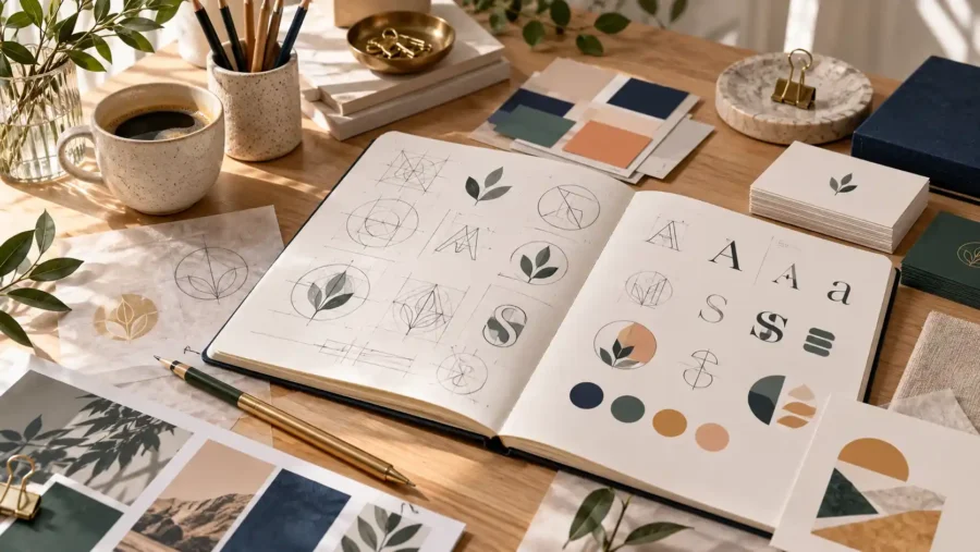
2. Organic forms
Not all logos need to be based on straight lines.
Organic shapes can create a softer and more personal look.
These could include, for example:
- leaf
- waves
- brushstroke
- abstract shapes
- soft contours
- hand-drawn details
This style of design often works well for creative, personal and natural brands.
3. Symbols with a clear link to the company
A symbol can help to quickly convey what a company does.
Example:
- a house for a property or interior design
- a leaf for nature or sustainability
- a tooth for dental treatment
- a paintbrush for creative activities
- a flower for beauty
- a camera for photography
But the symbol does not always have to be literal.
A more abstract symbol can make the logo more distinctive and allow for greater flexibility as the brand evolves.
The important thing is that the symbol feels relevant and doesn’t become too generic.
4. Letters and monograms
A logo does not necessarily have to contain a symbol at all.
In many cases, it is sufficient to use the company’s name or initials.
A monogram can be made up of:
- a letter
- two initials
- combined letters
- mirror-image shapes
- linked letters
It can create an elegant and timeless look.
Monograms work particularly well for brands where the name itself is a key part of their identity.
5. The typography may form the entire logo
A logo can consist solely of text.
That makes the choice of typeface all the more important.
Typography can make a brand feel:
- modern
- classic
- playful
- exclusive
- technical
- personal
Serif typefaces can create a more classic or sophisticated feel.
Sans serif fonts often feel modern and clear.
Handwritten typefaces can add a touch of personality, but need to be used with care to ensure they remain legible.
6. Combine symbols and text
One of the most common solutions is to combine a symbol with the company’s name.
It offers flexibility.
You can use the full logo in larger formats and just the symbol in smaller contexts.
For example:
- website
- social media
- favicon
- profile picture
- business card
- packaging
It is therefore a good idea to think of the logo as a system rather than a single file.
7. Negative space
Negative space refers to the empty area between or within shapes.
It can be used creatively to add an extra symbol or detail to the logo.
This often makes the logo more interesting and memorable.
However, it is important that the solution remains clear.
If the concept becomes too complicated, the logo may instead become difficult to understand.
8. Inspiration from the company’s name
The company name can be a good starting point.
Take a look at:
- first letter
- the meaning of the word
- the sound of the name
- any symbols
- possible forms
Sometimes a natural visual idea is already contained in the name.
For example, you could create a symbol from a single letter or combine several letters to form your own logo.
9. Inspiration from the industry
It’s a good idea to look at how other companies in the same sector present themselves visually.
Not to copy, but to understand which expressions are already in use.
Think about:
- which colours are common
- which symbols recur
- which typefaces are used
- what feels predictable
- how to get a divorce
A good logo needs to be appropriate for the industry whilst still having its own distinctive character.
10. Simplicity often works best
A logo should work equally well in both large and small sizes.
This means that too many details often become a problem.
A simple logo is easier to use on:
- website
- mobile
- business card
- social media
- signs
- branded clothing
It is therefore a good idea to test the logo at a very small size.
If it’s still clear, that’s a good sign.
Colour or black and white first?
It might be a good idea to start the logo design in black and white.
If the logo works without colour, the shape itself is often distinctive enough.
Colour can then be added to enhance the effect.
It also makes it easier to see whether the logo relies on colour to work.
The logo needs several versions
A professional logo often consists of several versions.
For example:
- main logo
- secondary logo
- symbol
- icon
- horizontal version
- vertical version
- black-and-white version
- colour version
This makes the logo much easier to use in different contexts.
Avoid following trends too much
It’s easy to be inspired by what feels modern right now.
However, the logo should ideally remain effective for many years to come.
That is why it is better to use trends as inspiration rather than letting them dictate the entire design.
A logo that is too trend-driven can quickly start to look dated.
Clarity and recognisability are more important than following every new trend.
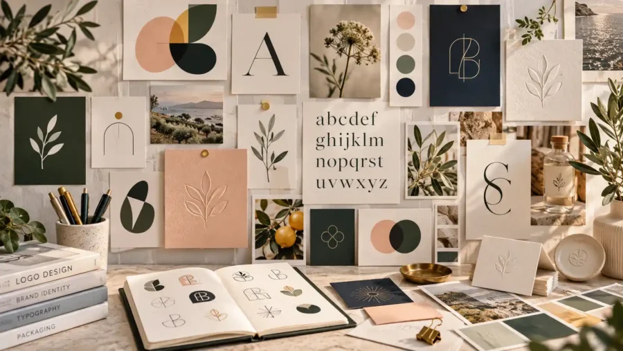
Create a mood board before you start
A mood board can help you find the right direction.
Collect examples of:
- logos
- colours
- typography
- forms
- illustrations
- materials
- photographs
This makes it easier to see which expressions go together.
A mood board also helps to establish a clearer direction before the actual design work begins.
What makes a logo memorable?
A good logo doesn’t have to be complicated.
Often, it is the simplest solutions that are the easiest to remember.
A memorable logo often has:
- clear form
- good balance
- simple structure
- distinctive look
- relevant connection to the brand
It also needs to work consistently alongside the rest of the visual identity.
Summary
Inspiration for logo design can come from shapes, symbols, letters, typography and the company’s own history.
The most important thing is to create a visual identity that suits the brand and works in a wide range of contexts.
Geometric shapes can provide structure, organic shapes can add more personality, and typography can carry the entire logo on its own.
A good logo doesn’t have to be complicated.
It needs to be clear, flexible and easily recognisable.
Find out more about our services
Would you like to create a logo that suits your business and feels well thought-out right from the start? Find out more about our services in branding and graphic design and how Svea Designs can help you create a clear and personalised visual identity.

 Swedish
 English
 Spanish